Thursday, January 3, 2013

Sexy @ 50

This was a super fun project that I worked on a last year (rather a few months back). The brief was to design a give-away at get-together/party that was being held for a few women who were turning 50. A group of ladies had decided to party sans husbands and celebrate this big milestone.

iPad covers definitely made a lot of sense and customized ones, specifically for the occasion even more. The idea for the design was to use elements from the "invite email" that had been sent out. Now, I'd rather not get into the (scandalous) content of the email :P , but I can tell you it was a great starting point for coming up with a colour palette, pattern and copy. If only briefs were as inspiring as that email.

The design was to be screen printed, since this iPad cover was to be given only to 15 ladies. So to keep it simple and sophisticated but cheap I stuck to a single colour print.

To start with, a "logo unit" was designed keeping in mind the tone of the party, the location and the year in which it was to be held.

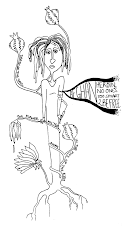
Once this unit was done I went on to create the pattern. The idea was to really use the content of the email and illustrate it. The pattern would be on the inside of the ipad, therefore, for the eyes of the ladies only. Think... "Dirty Little Secret"...
And this is what the final iPad cover looked like, with a hint of naughtiness seen on the lining. 
Got a chance to learn not only about fabrics, but what goes into making an ipad cover.. stuff like foam, buttons, stitches etc. This was all thanks to Robin, the tailor who helped me out every step of the way.


Saturday, December 15, 2012

TOTO

A poster from almost two years ago. This was for the Microsoft R&D Center in Bangalore. Did this during my first job (at Geek). The poster was for these "Discussion over Coffee" sessions that would take place every week, and all the employees were be expected to take part. We came with a concept of Time Out, Thoughts Out.. Hence coining the term TOTO! 

I think the poster probably explains what's happening better than me, on TOTO days.


Wednesday, December 12, 2012

Summer Carnival

Worked on this event earlier this year and just didn't get around to putting it up online. Anway, this was done for an awesome client. Shrikant's a great guy who gives a lot of space to me as a designer when I am working. I had designed his event company Oz Entertainment's logo earlier (which you can see here).

Moving on to the event which was a "Summer Carnival", a small music fest of sorts happening in Pune. For the event I designed a poster, a facebook cover photo and the tickets.

Here's the poster (that's filled with a whole lot of sponsor logos)


Tickets for the event


Given the short production time it turned out pretty well. Plus i got to play around a lot with the pen tool. Those few sleepless nights paid off. ;)


Sunday, December 9, 2012

IF: Explore

It's a phase I guess.. doodling and then scanning the doodle and creating a vector based version. Plus there's also been a recent 'Kawaii' obsession (that I am not ready to admit :P).

Anyway.. let me get to the point.. This just started of a very random scribble and turned into these flying fish. When I looked at my doodle all I could think of was... "My dream is to fly... Over the rainbow, so high".

This illustration is now available at my Society6 shop. You can get it as an iPhone/iPad case or a pillow or an art print or a tshirt even. :P

Wednesday, December 5, 2012

IF: Stretch


It would be too much of a STRETCH to party naked right??
This is something that started off as a sketch in the corner of my book (when i was pondering over 50Cent's lyrics of 'In Da Club') and then it took this form on my computer. 

Party safe!! Stay clothed! :D

Monday, May 21, 2012

IF: Sight

Surrounded by the bounty.. She looked around
But in her sight.. was no one to be found.

Tuesday, October 18, 2011

Guys and A Whale: Branding

This was an exciting project with a very cool client. My client is Venkatesh Nayak who is a vocalist. He was starting a new band with the name "Guys and a Whale", and if you know him.. you'd know know whose the whale was. :P
Anyway.. the genre is "stuff that can be heard and understood almost clearly".. a.k.a... Easy Listening.
So we decided the logo HAD TO have a whale in it.. and that was basically the starting point. The first step for me was to draw out a couple of whales and see what Venky had to say.


So after this I started playing around with what was possible with the mammal and the text. I had an idea of it being in a circle for which the first whale in the sketch worked rather well. Next step was to scan that bit and start working on illustrator.. Initially the whale was what I worked on, trying to finish it up a little while trying to make the form fit into an invisible circle. At this point the name of the band changed from the early 4 guys and a whale to just Guys and a Whale. Thankfully, not a major design change. At this stage got another approval from the client, just to make sure I was moving in the right direction. And from that approval onwards.. the struggle to get the type to work started.
Here are some of the iterations with typograhpy. I started out with some standard fonts to see if those would work.. Thanks to which my computer screen looked something like this (basically, not very pretty):


I knew I needed something else.. So I decided to develop my own type.. (something I am rather petrified of doing, coz it had been ages.. PLUS the rule of typography aren't exactly my best friends.)
None the less I thought I'd give it a try..


Once I got a hang of that, adding the type for the "and a' was the next challenge. Finally a couple of 100 fonts later, I'd like to believe I go it right (for a second I even gave up the custom type I had designed):

But finally (good) sense prevailed. And here is the final logo...


Venky decided to use the logo without the circle around it and it's now making rounds on Facebook.


Do check out the Guys and A Whale Facebook page. Some good music on it..
Totally had a blast of working on this logo, and it shows...AWESOME CLIENTS FTW!

Friday, October 14, 2011

IF: Contraption

So I have been feeling the serious urge to create collages recently, but I have been so busy with freelance and work that I haven't really had the time. Anyway, I tried out something for illustration friday coz I loved the word "Contraption" and had like an hour to kill.

Went with the theme of "Thinking and the creative process".. so what better contraption could there be.. than our MIND?!


Sunday, October 9, 2011

Mystique: Logo + Mural

Recently had the opportunity to work with a salon in Bangalore to redesign their identity and also paint a mural at the entrance.

The salon is called Mystique and it is a unisex parlour, which happens to be rather popular. While redesigning their identity the major guideline given by the client was that the logo should be a (more) typographic logo, something simple and uncomplicated. Their old logo was in cursive and that's something they wanted to move away from. As for colours, the palate had to be lavender, mauve, purple family, with perhaps a secondary colour.

Here are the two options I presented to the client.. I personally really like the second one.


However, in true client style they chose to go with the first option, but without the scissor :(
So now I had a purely typographic logo. Simple.
Here's the final logo:


Also designed the signage for the salon, an acrylic one that light's up at night. Don't have image of it in the evening.. but this is what it looks like:

The next on my list of to-do's was the mural. Took a bit of back and forth to come up with something we both liked and thought could be executed well. This was a reference image I created for painting the entrance of the Salon..
So it took 2 days to get the whole mural complete right from drawing-painting and sticking in the mirrors. I think I spent about 8hours per day working on it.

The process:
Considering this was my first time painting a wall, I think it turned out well. Learnt lots and was rather happy with the end result. The final mural:


Some details:


And.. that's all folks.. This is what kept me busy for a couple of days last week and it was fun! A little scary at first, but sooo worth it in the end! :)

Monday, May 23, 2011

IF: Soaked

It's been awhile since I did something for Illustration Friday. And, I hadn't used my Wacom tablet in ages... thought this was a good time to get it out. But it's apparent I have become a wee bit rusty with my illustration skills. Need to get back to doing this more often.


None the less... My attempt for 'Soaked'...


A broken heart, in pain she was soaked...