My Portable World is a blog/website that has news and review of mobile devices, phones, tablets, accessories, applications and services which help you make your world portable. You can check it out at http://myportableworld.com/
Some of the early ideas that I worked on:
And the final logo that is up on the My Portable World website:
The identity had to be modified so that it could be also used on twitter and facebook, and that's how "MPW" comes into play:
Wasted Walrus is a website started by my friend, where he posts comics that he draws out. Got a chance to go crazy with some psychedelic colour schemes and create a really fun identity for the walrus.
The website banner (click on it see the walrus change colours) :
Also designed some buttons for the website that have different colours on roll-over (obviously the Walrus seems to have quite the colourful personality) :
And then there was the Wasted Walrus background....
It went from trippy to terrible. Yeah, it happens.. I really like the way the first poster had turned out, ofcourse the event management didn't seem to agree and so I ended up with this...
And this was the first one that i was really happy with.. wanted this busy feel which had worked out well. Wish they had used this one.
Potential logo options for The Environment Group. TEG provides climate change advisory and sustainability services to its clients. Logos have been created for Prakrithy Design's pitch to the firm.
Just some logo that I designed for a friend who is opening up a franchise of mini donut carts. Don't know if any of these logos will be used. But I was pretty happy with the outcome.
L iast week I went absolutely crazy working on a friends business card, who is a DJ.
We decided on going for a collage sort of feel. Keeping that in mind I just went crazy and I think it shows. I generally work in a very rigid grid kinda style. So this was definitely different.
The idea stemmed from playing cards where if you flip the card the image still reads the same. However, here I wanted to show an abstract version of what's happening on a dance-floor. So you get both the DJ's view and the 'party animals' view. This idea carries to the back of the card as well.
After taking a vitamin pill on an empty stomach.. I have taken ill..suffering all day (How I love self-pity!)
But then it rained..and I wanted to get my Windsor Newton out.. and in my search for paper I found old photocopies which I decided to use as my "canvas".
This is me having fun on a lovely Bangalorean day. Hoping I can work some more with old sheets of useless copies...
PS I am still feeling sick (now going back into the world of more self pity)...
A poster I made for a party I was hosting after returning from Edinburgh in March, 2009
Merry Christmaaaas '08 Everybody
A wallpaper I had designed and sent out to close family and friends.
The Rip of Called Airlines
As much as I love this place, its over priced..Who charges 12rs for 1 idli and 17rs for a wada (that too in South India)? RIDICULOUS! But none the less..it's a nice place to hangout at! If u have more money and less brains..
London
Just a doodle on the way back to Edinburgh from London, on the train. The trees were too inspiring to be ignored.
DOGGAY!
A tribute to my fav. Yelahankan dog.. BOOTY!
Forever 21
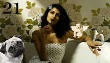
Collage for a friends 21st Birthday.. Nandu, this one's for you! :)
Afghan Heroin Poster
A poster I created after watching a documentry on National Geographic
Fish
A Banner for my Website
POSTER??
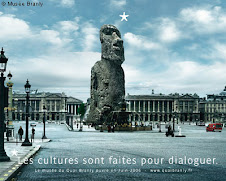
I am terribly confused as to how I am going to create a poster. I would like to incorporate elements from the museum that set it apart from other conventional museums. The objects on display are not "dead" but when a layout is created they seem rather dull and drab. How does one get past this? I think, the poster should act as a CATALYST that will make a viewer consider vsiting the museum. I want the poster to simple but the message it carries should be brief yet strong.